Approach
Librato shone with its dashboarding and alerting prowess, predominantly in the realm of server monitoring. However, it fell short when it came to offering a dedicated experience for its users on hosts or servers. On the other hand, TraceView excelled in scrutinising applications on servers and their intercommunication efficiency.
Since Librato boasted a more substantial user base, the first logical step was to enhance it by integrating the absent views. The game plan was to then transition TraceView users to this revamped experience, and the upgrade all our users under the shiny new AppOptics brand.
Since Librato boasted a more substantial user base, the first logical step was to enhance it by integrating the absent views. The game plan was to then transition TraceView users to this revamped experience, and the upgrade all our users under the shiny new AppOptics brand.
Research
By observing users and interviewing both customers and our internal team, we identified features that most people found valuable. We also spotted features mainly used by a select group of "power users."
Feedback hinted that many users grappled with navigating TraceView, often finding its information structure a tad convoluted – areas we were confident we could refine in the revamped product. Another observation was the inconsistent and sometimes puzzling language within the product, adding to user discomfort.
Another area we spotlighted was the product’s initiation process. New users faced a daunting learning curve, primarily because there was no guided in-product onboarding. Instead, they had to depend on direct assistance from a support engineer after purchasing. That’s something we knew could be streamlined for a smoother user experience.
User Goals
- Easy installation and an intuitive first time product experience.
- Quickly identifying, aka Firefighting, the root cause of a service degradation.
- Understanding service relationships and the latency between.
UI/UX
Onboarding
As an engineer, I wish to install AppOptics for my team so they can monitor the performance of our applications across a distributed infrastructure.
After signing up, I'm presented with simple instructions detailing how to install AppOptics for applications (APM) or on a server. After choosing APM and naming the service, I arrive at an Integrations page where I select the appropriate agent language for the service I've chosen to monitor - this generates a single command to run on the command line.
Once the agent is installed properly, AppOptics shows me as “Connected” and provides feedback about the data collected so far (hosts/containers, endpoints the application communicates with etc). Clicking through out of the install flow, I am then shown to the Service Overview highlighting some key endpoints or traces that I could start investigating immediately.
Below is an example user flow detailing the installation and first time product experience path.

With an understanding of the steps and data required to get a user into a successful state the team set out designing wireframes and subsequent high fidelity screens for the onboarding process.

Thanks to a robust onboarding process, AppOptics saw about 40% "data in" rates. This means nearly half of the users who tried the free version successfully linked an app or server to explore more of what we offer. Major kudos to the engineering team behind the agents. It was truly a collective team achievement.

Visualising Traces

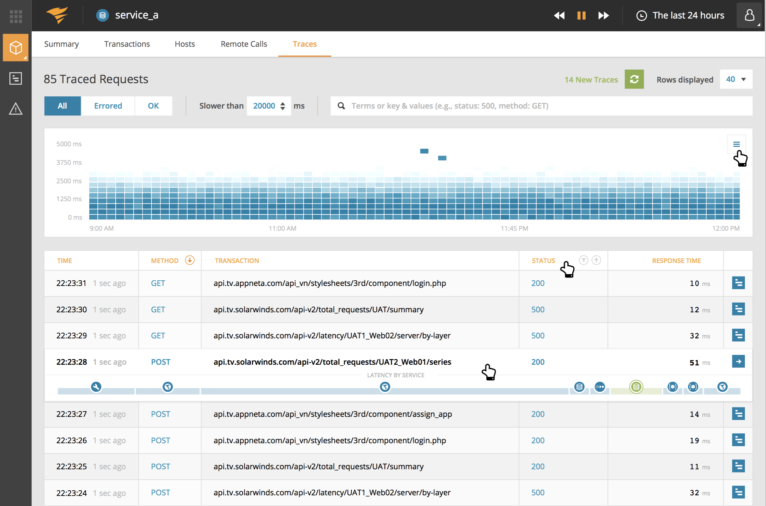
Once a single service was connected, data started pouring into the application, offering immediate value to our users. A standout feature transitioned from TraceView to AppOptics was the Trace Details screen. It presented a heatmap showing each app request's timing. In a well-performing app, all requests would have similar durations, keeping the heatmap's data points close on the y-axis. But if timings stray from the norm, the heatmap quickly flags them, letting users dig into slow requests and troubleshoot.

Even though users gained real insights from connecting a single service, the real benefit came from connecting multiple services in a microservices ecosystem. We wanted to make it simple to compare and contrast service and host performance in AppOptics and for that we turned to small multiple data visualization types.

Showcase
This article skims over features, IA, and design choices. Given the product's depth and richness, a 2-minute product demo might be the best way to showcase our team's accomplishments, along with those of other teams. Have a look!
